Flexbox
In this section, you will cover flexbox which means Flexible Box Module and all its concepts.
Flexbox is a layout model on CSS that makes it easier to position items on a web page depending on the screen size. Flexbox replaced float which was a previous technique to position items on a webpage.
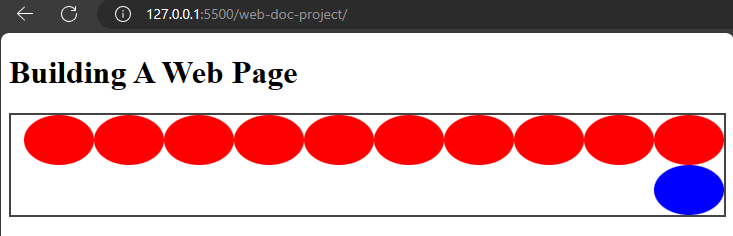
To use flexbox, you would need to set the display property to flex. The parent element you apply flex to is a container and the children are the items.
Example,
index.html
<!DOCTYPE html>
  <html>
    <head>
      <meta charset="utf-8"/>
      <title>A simple html page</title>
      <link rel="stylesheet" href="css/styles.css"/>
    </head>
    <body>
      <h1>Building A Web Page</h1>
      <div class="flex-container">
        <span class="flex-item"></span>
        <span class="flex-item"></span>
        <span class="flex-item"></span>
        <span class="flex-item"></span>
        <span class="flex-item"></span>
        <span class="flex-item"></span>
        <span class="flex-item"></span>
        <span class="flex-item"></span>
        <span class="flex-item"></span>
        <span class="flex-item"></span>
        <span class="flex-item blue"></span>
      </div>
    </body>
  </html>
styles.css
.flex-container {
  border: 2px solid #444;
  display: flex;
}

.flex-item {
  height: 50px;
  width: 70px;
  background-color: #f00;
  border-radius: 50%;
}

.blue {
  background-color: #00f;
}
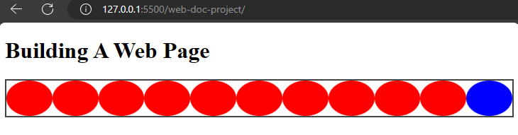
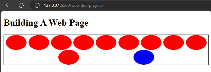
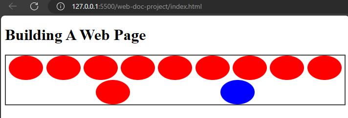
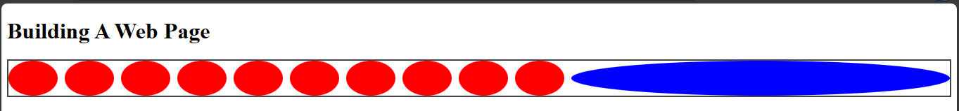
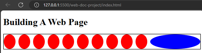
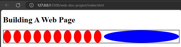
When you check your browser, you would discover flex had lined up the child elements because they are inheriting that flex property from the div.
Properties of flexbox
There are properties of flex which includes:
flex-directionflex-wrapflex-flowjustify-contentalign-contentalign-itemsalign-selfgapflex-growflex-shrinkflex-basisflex--- a shorthand forflex-grow,flex-shrink,flex-basis.
The flex-direction property
This property specifies the direction of flex items in a flex container. It defines the main axis and how you can place the items.
The property can take the following values:
- The
rowvalue: This is the default value offlex-direction. It places flex items horizontally in a row like the main axis, starting from the left and flowing to the right.
Example,
styles.css
.flex-container {
  border: 2px solid #444;
  display: flex;
  flex-direction: row;
}
This will show the content in the div element lying horizontally on the main axis.
- The
row-reversevalue: This value is similar to row, but it reverses the order of flex items. Flex items are displayed in a row from right to left, with the main axis still running horizontally.
Example,
styles.css
.flex-container {
  border: 2px solid #444;
  display: flex;
  flex-direction: row-reverse;
}
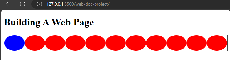
From the image, you will notice that the items were reversed with the last element moving to the first position.
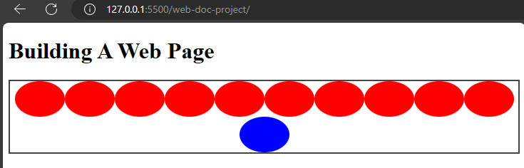
- The
columnvalue: This value places flex items vertically in a column. The main axis runs vertically, and the cross axis runs horizontally.
Example,
styles.css
.flex-container {
  border: 2px solid #444;
  display: flex;
  flex-direction: column;
}
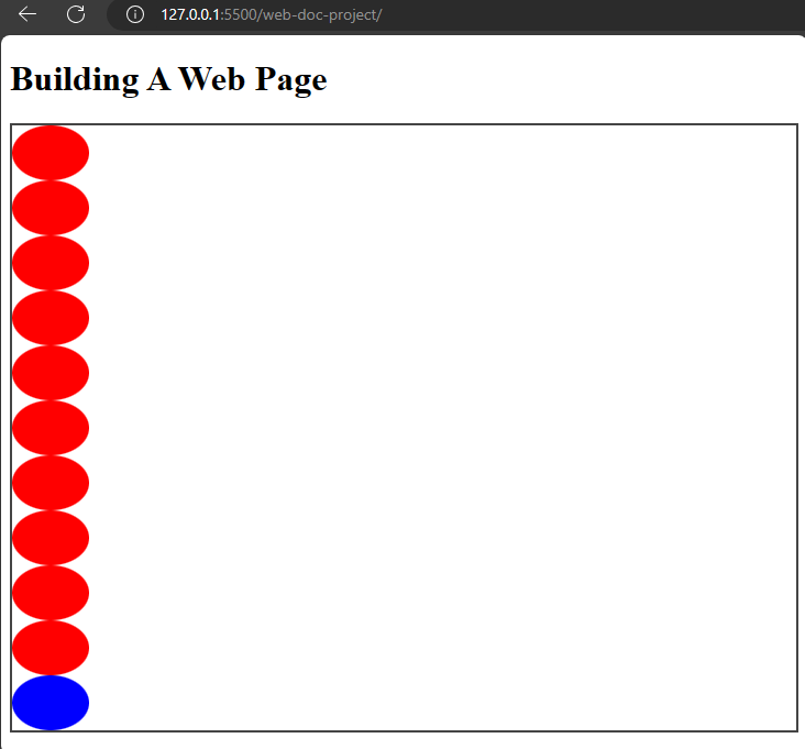
That will place the items in a vertical position in the image.
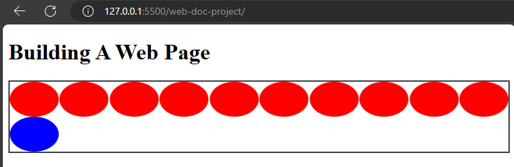
- The
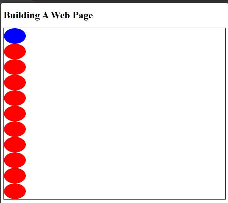
column-reversevalue: This reverses the order of flex items in a column.
Example,
styles.css
.flex-container {
  border: 2px solid #444;
  display: flex;
  flex-direction: column-reverse;
}
The flex-wrap property
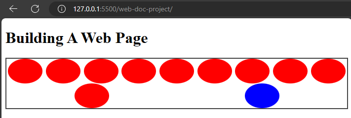
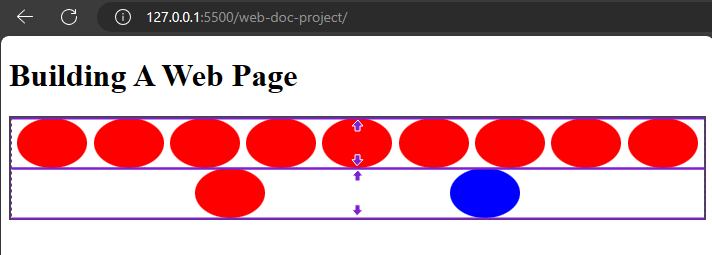
The flex-wrap property controls how flex items position themselves in a container. If they are too big to fit in a line, using the wrap value will make the items occupy the first line and move to the second line.
There are other flex-wrap values which are:
- The
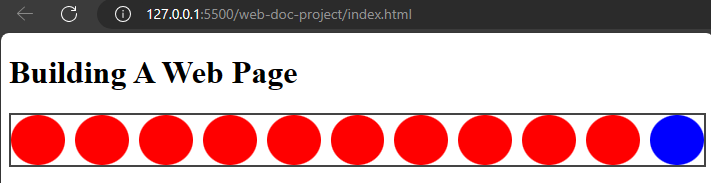
nowrapvalue: This is the default value that makes flex-items shrink to remain in a single line.
Example,
styles.css
.flex-container {
  border: 2px solid #444;
  display: flex;
  flex-direction: row;
  flex-wrap: nowrap;
}

This makes the flex items remain on a single line.
- The
wrapvalue: Thewrapvalue makes the items flow into additional lines to accommodate themselves.
Example,
styles.css
.flex-container {
  border: 2px solid #444;
  display: flex;
  flex-direction: row;
  flex-wrap: wrap;
}

Now, the items are flowing to another line to accomodate each other.
- The
wrap-reversevalue: This value is similar to wrap, but in the reverse direction.
Example,
styles.css
.flex-container {
  display: flex;
  flex-direction: row;
  flex-wrap: wrap-reverse;
}
The flex items will wrap but in the reverse direction.

The flex-flow shorthand property
The flex-flow is a property that combines the flex-direction and flex-wrap properties.
Example,
styles.css
.flex-container {
  display: flex;
  flex-flow: row wrap;
}
That will make the items be in the row direction and wrap as well.
The justify-content property
The justify-content property makes flex items align along the main axis of a flex container. It distributes space around flex items.
The justify-content property accepts several values:
- The
flex-startvalue: This value positions the items at the start of the container's main axis.
Example,
styles.css
.flex-container {
  border: 2px solid #444;
  display: flex;
  flex-flow: row wrap;
  justify-content: flex-start;
}
This will move the items to the top left position of the container which is its default position.
- The
flex-endvalue: This moves the flex items to the bottom of the flex container.
Example,
styles.css
.flex-container {
  border: 2px solid #444;
  display: flex;
  flex-flow: row wrap;
  justify-content: flex-end;
}
This will move the items to the bottom of the container.
- The
centervalue: This value centers flex items along the main axis of the container.
Example,
styles.css
.flex-container {
  border: 2px solid #444;
  display: flex;
  flex-flow: row wrap;
  justify-content: center;
}
This will place the flex items at the center of the flex container.
- The
space-betweenvalue: This value distributes flex items equally along the main axis. It creates consistent spacing among the flex items.
Example,
styles.css
.flex-container {
  border: 2px solid #444;
  display: flex;
  flex-flow: row wrap;
  justify-content: space-between;
}
This will make the items space out in the container.
- The
space-aroundvalue: This value evenly distributes the flex items along the main axis, but with space both before and after each item. The space between items is equal and half the size of the space before and after the first and last items.
Example,
styles.css
.flex-container {
  border: 2px solid #444;
  display: flex;
  flex-flow: row wrap;
  justify-content: space-around;
}
- The
space-evenlyvalue: This value distributes flex items equally, ensuring equal spacing between the flex items.
Example,
styles.css
.flex-container {
  border: 2px solid #444;
  display: flex;
  flex-flow: row wrap;
  justify-content: space-evenly;
}
That will cause the flex items to space evenly.
The align-items property
The align-items property aligns items vertically on the cross axis.
The values are:
- The
stretchvalue: This is the default value which makes the items stretch and fill the container vertically.
Example,
styles.css
.flex-container {
  border: 2px solid #444;
  display: flex;
  flex-flow: row wrap;
  justify-content: space-evenly;
  align-items: stretch;
}
- The
flex-startvalue: This value aligns flex items at the start of a container. - The
flex-endvalue: This value aligns items at the end of a container. - The
centervalue: This value aligns items at the center. - The
baselinevalue: This value aligns items at the baseline.
The align-self property
This property controls the alignment of an individual flex item along the cross axis of the flex container.
The align-self property takes the same values as align-items which are: stretch, flex-start, flex-end, center, and baseline values.
It also has an additional value named auto this is the default value and it makes the flex item inherit the value of the align-items property on the flex container.
Example,
index.html
<div class="flex-container">
  <span class="flex-item"></span>
  <span class="flex-item"></span>
  <span class="flex-item"></span>
  <span class="flex-item"></span>
  <span class="flex-item"></span>
  <span class="flex-item"></span>
  <span class="flex-item"></span>
  <span class="flex-item"></span>
  <span class="flex-item"></span>
  <span class="flex-item"></span>
  <span class="flex-item blue first-p"></span>
</div>
styles.css
.flex-container {
  display: flex;
  flex-direction: row;
  flex-wrap: wrap;
  justify-content: space-evenly;
  align-items: stretch;
}
.flex-container .first-p {
  align-self: center;
}
The gap property
The gap property applies in both flex and grid containers. In a flex container, the gap property creates spacing between rows and columns in the flex container.
When you specify a single value, the gap property will set the value for both row and column gap.
When you specify for double values, it will set the values for row and column separately.
Example,
styles.css
.flex-container {
  border: 2px solid #444;
  display: flex;
  gap: 20px 10px;
}
Now the shapes are spaced out with a spacing of 20px and 10px.
The gap property simplifies the process of adding consistent spacing between flex items within a container.
The flex-grow property
The flex-grow property controls how flex items grow within a flex container along the main axis.
Key points about the flex-grow property
- This
flex-growis applied to individual flex items. - It accepts a unitless value, by default the value is set to
0. Which means the flex items will not grow and will retain its original size.
Example,
styles.css
.flex-container {
  border: 2px solid #444;
  display: flex;
  gap: 20px 10px;
}

.flex-container .first-p {
  flex-grow: 1;
}
Now, the blue coloured shape will grow to accomodate the sizing.
That will cause the first paragraph to grow in size.
The flex-shrink property
This property determines how flex items shrink when there is not enough space available within the flex container along the main axis.
Key points about the flex-shrink property
- The
flex-shrinkis like theflex-growproperty as it is used on individual flex items. - It also accepts a unitless value and the default value is
1.
Example,
styles.css
.flex-container {
  border: 2px solid #444;
  display: flex;
  gap: 20px 10px;
}

.flex-container .first-p {
  flex-shrink: 1;
}
This will cause the blue circle to retain its size and shrink to accomodate any adjustment.
The flex-basis property
This property specifies the ideal or default size of a flex item, regardless of its actual content or the available space within the flex container.
Key points about the flex-basis property
- It accepts length values (such as pixels or percentages) or the
autokeyword. - The
autovalue makes the flex item size itself based on its content or the value of theheightorwidthproperty.
Example,
styles.css
.flex-container {
  border: 2px solid #444;
  display: flex;
  gap: 20px 10px;
}

.flex-container .first-p {
  flex-basis: 300px;
}
This will make the blue shape have an initial width of 300px along the main axis.
The flex-grow, flex-shrink, flex-basis properties work together to determine how flex items are sized and distributed within the flex container.
The flex property
The flex property is a shorthand for flex-grow, flex-shrink, and flex-basis properties. It accepts three values for the flex-grow, flex-shrink, and flex-basis respectively.
The flex property is more popular and it is what most designers use instead of the other properties.
Example,
styles.css
.flex-container {
  border: 2px solid #444;
  display: flex;
  gap: 20px 10px;
}

.flex-container .first-p {
  flex: 1 0 300px;
}
This will cause the blue shape to grow (flex-grow: 1), to not shrink (flex-shrink: 0), and to have an initial size of 300px (flex-basis: 300px).
That sums up the properties of flexbox that it uses to position items on a webpage. Flexbox uses the parent element as the flex container while the child elements are the flex items.