Background property in CSS
The background property is a CSS shorthand property for the various background properties. Which are,
- The
background-colorproperty. - The
background-imageproperty. - The
background-sizeproperty. - The
background-attachmentproperty. - The
background-repeatproperty. - The
background-positionproperty. - The
background-originproperty. - The
background-clipproperty
CSS uses the background property for all these properties above. When you use the background property for any of the properties above. Your browser engine will determine which one by the values you pass in as the properties have their unique values.
You have covered all the properties apart from background-origin and background-clip properties.
The background-origin property
This property sets the position of an image in relation to the border, padding and content.
CSS ignores the background-origin property when you set background-attachment to fixed. But you can still use the background-origin property when the background-attachment is not set to fixed.
The property has three values which are:
- The
border-boxvalue. - The
padding-boxvalue. - The
content-boxvalue.
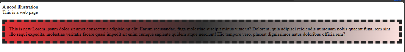
The border-box value
With this value, you get to position your background inside the border.
Example,
index.html
<!DOCTYPE html>
<html>
  <head>
    <meta charset="utf-8"/>
    <title>A simple html page</title>
    <link rel="stylesheet" href="styles.css"/>
  </head>
  <body>
    <header>A good illustration</header>
    <main>This is a web page</main>
    <p>This is new Lorem ipsum dolor sit amet consectetur adipisicing elit. Earum recusandae,
      fuga molestiae suscipit minus vitae ut? Dolorem, quia adipisci reiciendis numquam nobis quaerat fuga,
      rem sint illo sequi expedita, molestiae veritatis facere quasi impedit sit enim cumque sapiente quidem
      atque nesciunt! Hic tempore vero, placeat dignissimos natus doloribus officia rem?
    </p>
  </body>
</html>
styles.css
p {
  color: black;
  border: 8px dashed #222;
  padding: 15px;
  background: linear-gradient(100deg, rgb(230,50,55), #333, mistyrose);
  background-origin: border-box;
}
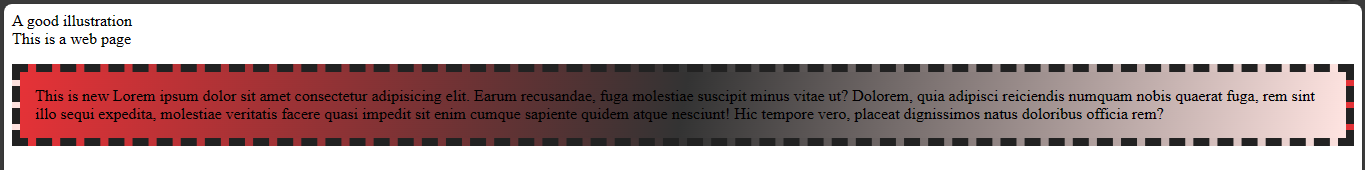
The padding-box value
With this value, you get to set your background inside the padding.
Example,
index.html
<!DOCTYPE html>
<html>
  <head>
    <meta charset="utf-8"/>
    <title>A simple html page</title>
    <link rel="stylesheet" href="styles.css"/>
  </head>
  <body>
    <header>A good illustration</header>
    <main>This is a web page</main>
    <p>This is new Lorem ipsum dolor sit amet consectetur adipisicing elit. Earum recusandae,
      fuga molestiae suscipit minus vitae ut? Dolorem, quia adipisci reiciendis numquam nobis quaerat fuga,
      rem sint illo sequi expedita, molestiae veritatis facere quasi impedit sit enim cumque sapiente quidem
      atque nesciunt! Hic tempore vero, placeat dignissimos natus doloribus officia rem?
    </p>
  </body>
</html>
styles.css
p {
  color: black;
  border: 8px dashed #222;
  padding: 15px;
  background: linear-gradient(100deg, rgb(230,50,55), #333, mistyrose);
  background-origin: padding-box;
}
The content-box value
The content-box sets the background in relation to the content.
Example,
index.html
<!DOCTYPE html>
<html>
  <head>
    <meta charset="utf-8"/>
    <title>A simple html page</title>
    <link rel="stylesheet" href="styles.css"/>
  </head>
  <body>
    <header>A good illustration</header>
    <main>This is a web page</main>
    <p>This is new Lorem ipsum dolor sit amet consectetur adipisicing elit. Earum recusandae,
      fuga molestiae suscipit minus vitae ut? Dolorem, quia adipisci reiciendis numquam nobis quaerat fuga,
      rem sint illo sequi expedita, molestiae veritatis facere quasi impedit sit enim cumque sapiente quidem
      atque nesciunt! Hic tempore vero, placeat dignissimos natus doloribus officia rem?
    </p>
  </body>
</html>
styles.css
p {
  color: black;
  border: 8px dashed #222;
  padding: 15px;
  background: linear-gradient(100deg, rgb(230,50,55), #333, mistyrose);
  background-origin: content-box;
}
Now, let's look at the background-clip property
The background-clip property
This property determines how the background adjusts to the border, padding or content.
It has four values which are:
- The
border-boxvalue. - The
padding-boxvalue. - The
content-boxvalue. - The
textvalue.
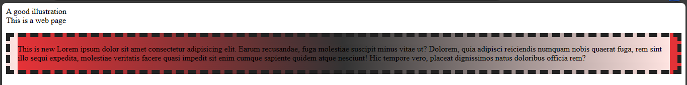
The border-box value
This value makes the background to reach the border. This means applying background colour or image to an element with this value will cause the background property to cover all of the element's sides including the border. This is the default value of the clip property.
Example,
index.html
<!DOCTYPE html>
<html>
  <head>
    <meta charset="utf-8"/>
    <title>A simple html page</title>
    <link rel="stylesheet" href="styles.css"/>
  </head>
  <body>
    <header>A good illustration</header>
    <main>This is a web page</main>
    <p>This is new Lorem ipsum dolor sit amet consectetur adipisicing elit. Earum recusandae,
      fuga molestiae suscipit minus vitae ut? Dolorem, quia adipisci reiciendis numquam nobis quaerat fuga,
      rem sint illo sequi expedita, molestiae veritatis facere quasi impedit sit enim cumque sapiente quidem
      atque nesciunt! Hic tempore vero, placeat dignissimos natus doloribus officia rem?
    </p>
  </body>
</html>
styles.css
p {
color: black;
border: 8px dashed #222;
padding: 15px;
background: linear-gradient(100deg, rgb(230,50,55), #333, mistyrose);
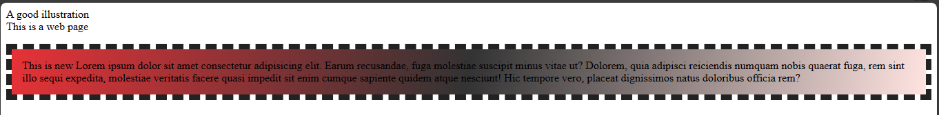
background-clip: border-box;
}
 From the image above, the background colour extends to the border of the paragraph element because of the
 border-box value.
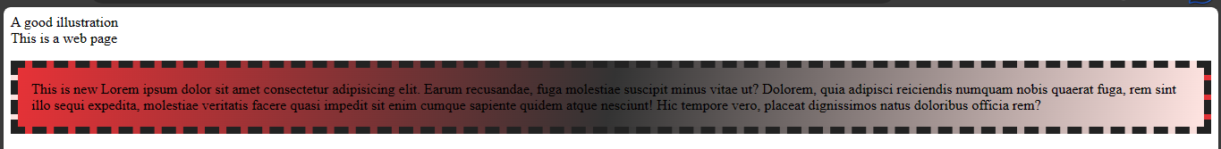
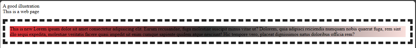
The padding-box value
It makes the background property to cover the entire element excluding the border.
Example,
index.html
<!DOCTYPE html>
<html>
  <head>
    <meta charset="utf-8"/>
    <title>A simple html page</title>
    <link rel="stylesheet" href="styles.css"/>
  </head>
  <body>
    <header>A good illustration</header>
    <main>This is a web page</main>
    <p>This is new Lorem ipsum dolor sit amet consectetur adipisicing elit. Earum recusandae,
      fuga molestiae suscipit minus vitae ut? Dolorem, quia adipisci reiciendis numquam nobis quaerat fuga,
      rem sint illo sequi expedita, molestiae veritatis facere quasi impedit sit enim cumque sapiente quidem
      atque nesciunt! Hic tempore vero, placeat dignissimos natus doloribus officia rem?
    </p>
  </body>
</html>
styles.css
p {
  color: black;
  border: 8px dashed #222;
  padding: 15px;
  background: linear-gradient(100deg, rgb(230,50,55), #333, mistyrose);
  background-clip: padding-box;
}
The next value is the content-box value.
The content-box value
This value makes the background cover only the body of the content.
Example,
index.html
<!DOCTYPE html>
<html>
  <head>
    <meta charset="utf-8"/>
    <title>A simple html page</title>
    <link rel="stylesheet" href="styles.css"/>
  </head>
  <body>
    <header>A good illustration</header>
    <main>This is a web page</main>
    <p>This is new Lorem ipsum dolor sit amet consectetur adipisicing elit. Earum recusandae,
      fuga molestiae suscipit minus vitae ut? Dolorem, quia adipisci reiciendis numquam nobis quaerat fuga,
      rem sint illo sequi expedita, molestiae veritatis facere quasi impedit sit enim cumque sapiente quidem
      atque nesciunt! Hic tempore vero, placeat dignissimos natus doloribus officia rem?
    </p>
  </body>
</html>
styles.css
p {
  color: black;
  border: 8px dashed #222;
  padding: 15px;
  background: linear-gradient(100deg, rgb(230,50,55), #333, mistyrose);
  background-clip: content-box;
}
That sums up the values of the background-clip and other background properties in css. CSS has a shorthand/shortcut property which it uses to combine some of these properties together. This property is called the background property.
The background shorthand property
The background property can combine different properties together. You could use it for a background image, color, position, origin, size and so on.
Example,
index.html
<!DOCTYPE html>
<html>
  <head>
    <meta charset="utf-8"/>
    <title>A simple html page</title>
    <link rel="stylesheet" href="styles.css"/>
  </head>
  <body>
    <header>A good illustration</header>
    <main>This is a web page</main>
    <p>This is new Lorem ipsum dolor sit amet consectetur adipisicing elit. Earum recusandae,
      fuga molestiae suscipit minus vitae ut? Dolorem, quia adipisci reiciendis numquam nobis quaerat fuga,
      rem sint illo sequi expedita, molestiae veritatis facere quasi impedit sit enim cumque sapiente quidem
      atque nesciunt! Hic tempore vero, placeat dignissimos natus doloribus officia rem?
    </p>
  </body>
</html>
styles.css
body {
  color: white;
  background: url("../img/momentum.jpeg") #ae99ef no-repeat center / cover;
}
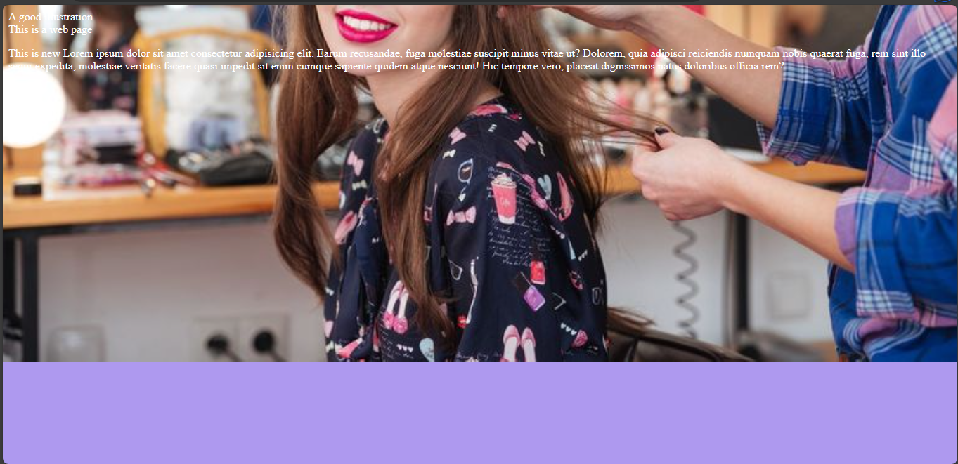
With the property shorthand, I combined background properties like background-size, background-position, background-repeat, background-image, and background-color.
So that's the power of the background shorthand property. It lets you combine multiple properties together.