CSS grid
This is the last part of the CSS session. Congrats on making it this far!
Grid is an important concept in CSS. Just like Flexbox, grid is a layout model of rows and columns in a grid system. Which is used to design web pages. Grid also replaced floats as a positioning technique.
A grid layout consist of the parent element which is the container while the child elements are the items.
Properties of grid
There are properties of grid which includes:
- The
displayproperty - The
grid-template-columnsproperty - The
grid-template-rowsproperty - The
grid-template-areasproperty - The
grid-templateshorthand property - The
gridproperty - The
gapproperty - The
justify-itemsproperty - The
align-itemsproperty - The
place-itemsproperty - The
justify-contentproperty - The
align-contentproperty - The
place-contentproperty
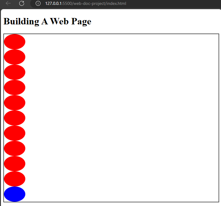
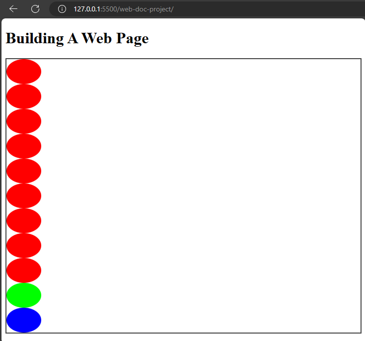
The display property
This is the first property you would need to set when using a CSS grid because it will set the display type of the element to grid.
Example,
index.html
<!DOCTYPE html>
  <html>
    <head>
      <meta charset="utf-8"/>
      <title>A simple html page</title>
      <link rel="stylesheet" href="css/styles.css"/>
    </head>
    <body>
      <h1>Building A Web Page</h1>
      <div class="grid-container">
        <span class="grid-item"></span>
        <span class="grid-item"></span>
        <span class="grid-item"></span>
        <span class="grid-item"></span>
        <span class="grid-item"></span>
        <span class="grid-item"></span>
        <span class="grid-item"></span>
        <span class="grid-item"></span>
        <span class="grid-item"></span>
        <span class="grid-item"></span>
        <span class="grid-item blue first-p"></span>
      </div>
    </body>
  </html>
styles.css
.grid-container {
  display: grid;
}

.grid-item {
  height: 50px;
  width: 70px;
  background-color: #f00;
  border-radius: 50%;
}

.blue {
  background-color: #00f;
}
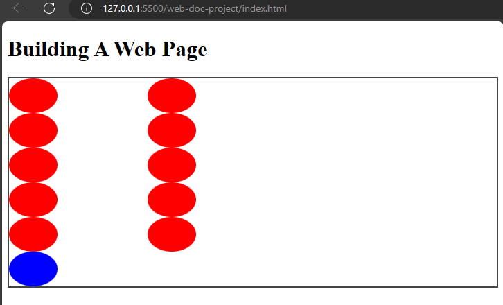
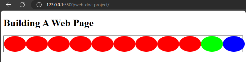
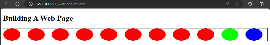
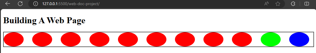
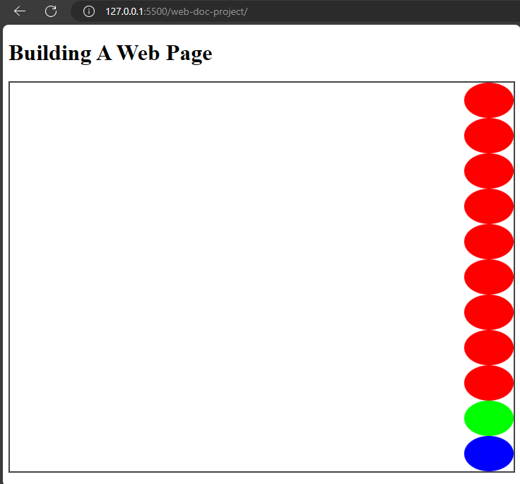
The grid-template-columns property
This property specifies the number and width of the columns in the grid layout. The values can be specified as keyword, length or percentages.
Example,
index.html
<!DOCTYPE html>
  <html>
    <head>
      <meta charset="utf-8"/>
      <title>A simple html page</title>
      <link rel="stylesheet" href="css/styles.css"/>
    </head>
    <body>
      <h1>Building A Web Page</h1>
      <div class="grid-container">
        <span class="grid-item"></span>
        <span class="grid-item"></span>
        <span class="grid-item"></span>
        <span class="grid-item"></span>
        <span class="grid-item"></span>
        <span class="grid-item"></span>
        <span class="grid-item"></span>
        <span class="grid-item"></span>
        <span class="grid-item"></span>
        <span class="grid-item"></span>
        <span class="grid-item blue first-p"></span>
      </div>
    </body>
  </html>
styles.css
.grid-container {
  border: 2px solid #444;
  display: grid;
  grid-template-columns: 200px 2fr;
}
This will cause the div element to have a template columns of 200px and 2fr.
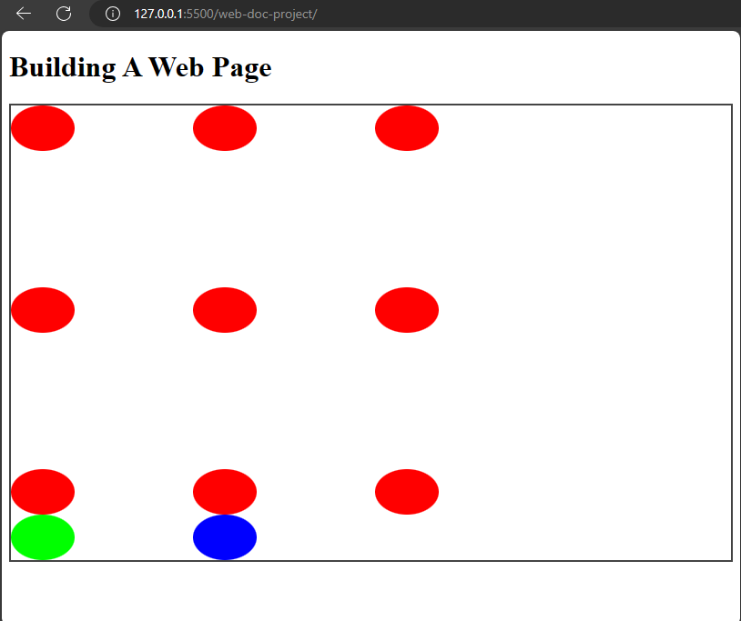
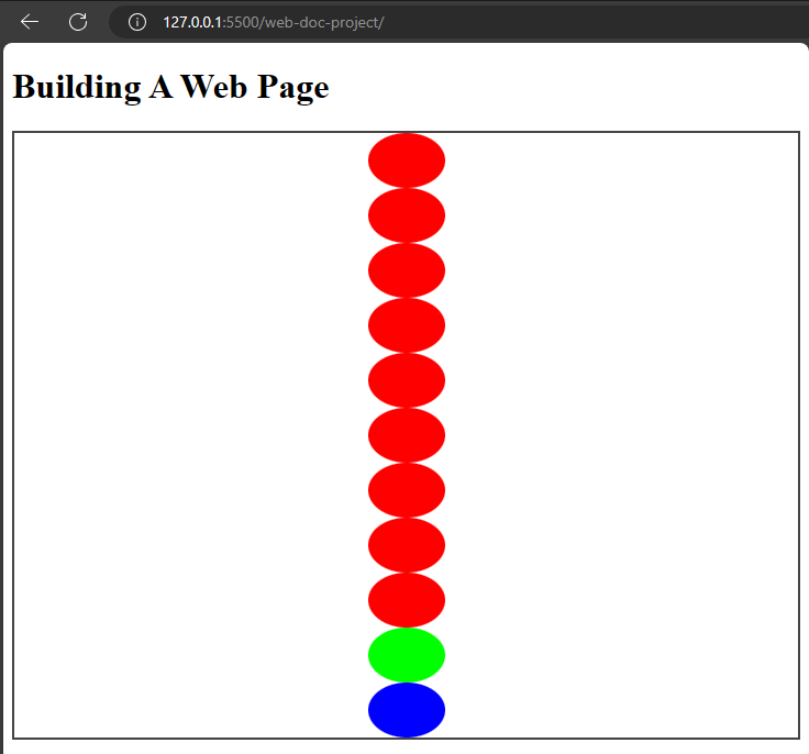
The grid-template-rows property
This property has to do with the heights of rows in the grid layout. The values can be in keyword, length or percentages.
Example,
index.html
<!DOCTYPE html>
  <html>
    <head>
      <meta charset="utf-8"/>
      <title>A simple html page</title>
      <link rel="stylesheet" href="css/styles.css"/>
    </head>
    <body>
      <h1>Building A Web Page</h1>
      <div class="grid-container">
        <span class="grid-item"></span>
        <span class="grid-item"></span>
        <span class="grid-item"></span>
        <span class="grid-item"></span>
        <span class="grid-item"></span>
        <span class="grid-item"></span>
        <span class="grid-item"></span>
        <span class="grid-item"></span>
        <span class="grid-item"></span>
        <span class="grid-item"></span>
        <span class="grid-item blue first-p"></span>
      </div>
    </body>
  </html>
styles.css
.grid-container {
  border: 2px solid #444;
  display: grid;
  grid-template-rows: repeat(10, 100px);
}
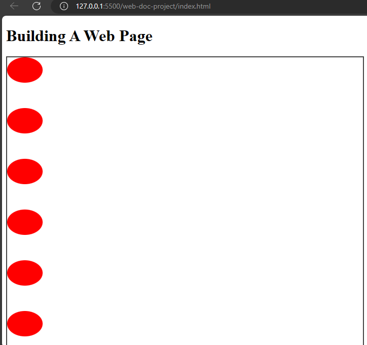
I used the repeat function to set the shapes in a spacing of 100px which repeats ten times so the shapes have a spacing of 100px width in between them.
The grid-template-areas property
Like the name implies, this property specifies grid areas with their names. It controls how the items are placed.
It combines the various values for grid-template-areas like grid-row-start, grid-column-start, grid-column-end, and so on.
Example,
index.html
<!DOCTYPE html>
  <html>
    <head>
      <meta charset="utf-8"/>
      <title>A simple html page</title>
      <link rel="stylesheet" href="css/styles.css"/>
    </head>
    <body>
      <h1>Building A Web Page</h1>
      <div class="grid-container">
        <span class="grid-item"></span>
        <span class="grid-item"></span>
        <span class="grid-item"></span>
        <span class="grid-item"></span>
        <span class="grid-item"></span>
        <span class="grid-item"></span>
        <span class="grid-item"></span>
        <span class="grid-item"></span>
        <span class="grid-item"></span>
        <span class="grid-item green ball2"></span>
        <span class="grid-item blue ball1"></span>
      </div>
    </body>
  </html>
styles.css
.grid-container {
  border: 2px solid #444;
  display: grid;
  grid-template-areas: 'header' 'footer';
}


.grid-item {
  height: 50px;
  width: 70px;
  background-color: #f00;
  border-radius: 50%;
}

.blue {
  background-color: #00f;
}

.green {
  background-color: #0f0;
}

.ball2 {
  grid-area: header;
}

.ball1 {
  grid-area: footer;
}
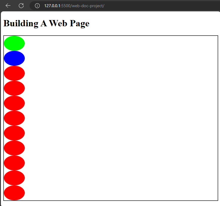
This places the green ball before the blue ball while the remaining balls are beneath it.
The grid-template shorthand property
This is a shorthand property for defining grid-template-rows, grid-template-columns, and grid-template-areas.
Example,
styles.css
.grid-container {
  border: 2px solid #444;
  display: grid;
  grid-template: 200px 200px / 200px 200px 200px;
}
In this example, I combined grid-template-rows and grid-template-columns for the grid-template shorthand.
The grid property
The grid property is a shorthand property for grid-template-columns,grid-template-rows,grid-template-areas,grid-auto-rows,grid-auto-flow, and grid-auto-columns.
Example,
index.html
<!DOCTYPE html>
  <html>
    <head>
      <meta charset="utf-8"/>
      <title>A simple html page</title>
      <link rel="stylesheet" href="css/styles.css"/>
    </head>
    <body>
      <h1>Building A Web Page</h1>
      <div class="grid-container">
        <span class="grid-item"></span>
        <span class="grid-item"></span>
        <span class="grid-item"></span>
        <span class="grid-item"></span>
        <span class="grid-item"></span>
        <span class="grid-item"></span>
        <span class="grid-item"></span>
        <span class="grid-item"></span>
        <span class="grid-item"></span>
        <span class="grid-item green"></span>
        <span class="grid-item blue"></span>
      </div>
    </body>
  </html>
styles.css
.grid-container {
  border: 2px solid #444;
  display: grid;
  grid: 50% / auto-flow dense;
}

.grid-item {
  height: 50px;
  width: 70px;
  background-color: #f00;
  border-radius: 50%;
}

.blue {
  background-color: #00f;
}

.green {
  background-color: #0f0;
}
In this example, I combined grid-template-rows with 50%, grid-auto-flow for the density and the grid-autos for the auto.
The gap property
This is a shorthand property for grid-row-gap and grid-column-gap properties. The grid-row-gap property defines the gap between rows in the grid layout. The grid-column-gap defines the gap between columns in the grid layout.
Example,
styles.css
.grid-container {
  border: 2px solid #444;
  display: grid;
  grid: 50% / auto-flow dense;
  gap: 10px;
}
The gap property will make the balls which are the grid items to have an equal spacing of 10px length. If you want to give the grid items different length values (for the row and the column) you could do so too.
Example,
styles.css
.grid-container {
  border: 2px solid #444;
  display: grid;
  grid: 50% / auto-flow dense;
  gap: 10px 15px;
}
You could also use percentages or percentages and length values to specify the gap property.
The justify-items property
justify-items aligns items in a row in a grid container. The values are start, center, end, stretch, and so on.
- The
startvalue
This value aligns items at the start of the grid container. It is the opposite of the end value.
styles.css
.grid-container {
  border: 2px solid #444;
  display: grid;
  justify-items: start;
}
- The
centervalue
This value aligns items at the center of the grid container.
styles.css
.grid-container {
  border: 2px solid #444;
  display: grid;
  justify-items: start;
}
- The
endvalue
Aligns items at the end of the container.
Example,
styles.css
.grid-container {
  border: 2px solid #444;
  display: grid;
  justify-items: end;
}
That will cause the items to align at the end of the container.
- The
stretchvalue This value only works when the size of the container is larger then the items so the items could stretch to occupy the space.
The next property is the align-items property.
The align-items property
The align-items property is like the justify-items property but it aligns items in the column axis. justify-items is in the row axis.
Example,
styles.css
.grid-container {
  display: grid;
  align-items: end;
}
This will cause the items to align at the bottom of the grid container.
The place-items property
This is a shorthand property for both justify-items and align-items properties.
Example,
styles.css
.grid-container {
  display: grid;
  place-items: end center;
}
You can also set a single value for both properties using place-items.
Example,
styles.css
.grid-container {
  display: grid;
  place-items: center;
}
This will make the items to align at the center for justify-items and align-items properties.
The justify-content property
The justify-content property aligns items along the row axis in a grid container. The values are start, center, stretch, end, and space-between.
Example,
styles.css
.grid-container {
  display: grid;
  grid-template-columns: repeat(3, 1fr);
  justify-content: center;
}
That will make the items to be positioned at the center of the grid container.
The align-content property
This aligns items along the cross axis of a grid container. It is the column axis of a container.
Like justify-content, it uses these values; start, end, stretch, space-around,space-between, center.
Example,
styles.css
.grid-container {
  display: grid;
  align-content: center;
}
The place-content property
This is a shorthand property for justify-content and the align-items property. Like place-items, when you specify a single value, the browser assumes it to be for both justify-content and align-content.
Example,
styles.css
.grid-container {
  display: grid;
  place-content: center;
}
That sums up the main properties of grid in css.Check CSS tricks for more on grids.